Case study / The Omni Stack journal
A stronger first impression: the Onsite IT website rebuild
From a compact, older layout to a clear IT services website built around the next customer conversation.
The starting point
A website rebuild should help visitors understand your business, evaluate your services, and contact you with confidence. Onsite IT shows how a clearer first impression can support those goals.
An established business can outgrow its website long before it outgrows its expertise. For an IT provider, that gap matters: prospective customers are looking for someone they can trust with the technology their own business depends on.
Omni Stack Systems rebuilt the Onsite IT website with a modern, responsive design, clearer service messaging, and an easier path to getting in touch. This case study looks at the visible changes and why they matter for a small business considering a similar update.
Onsite IT: before and after
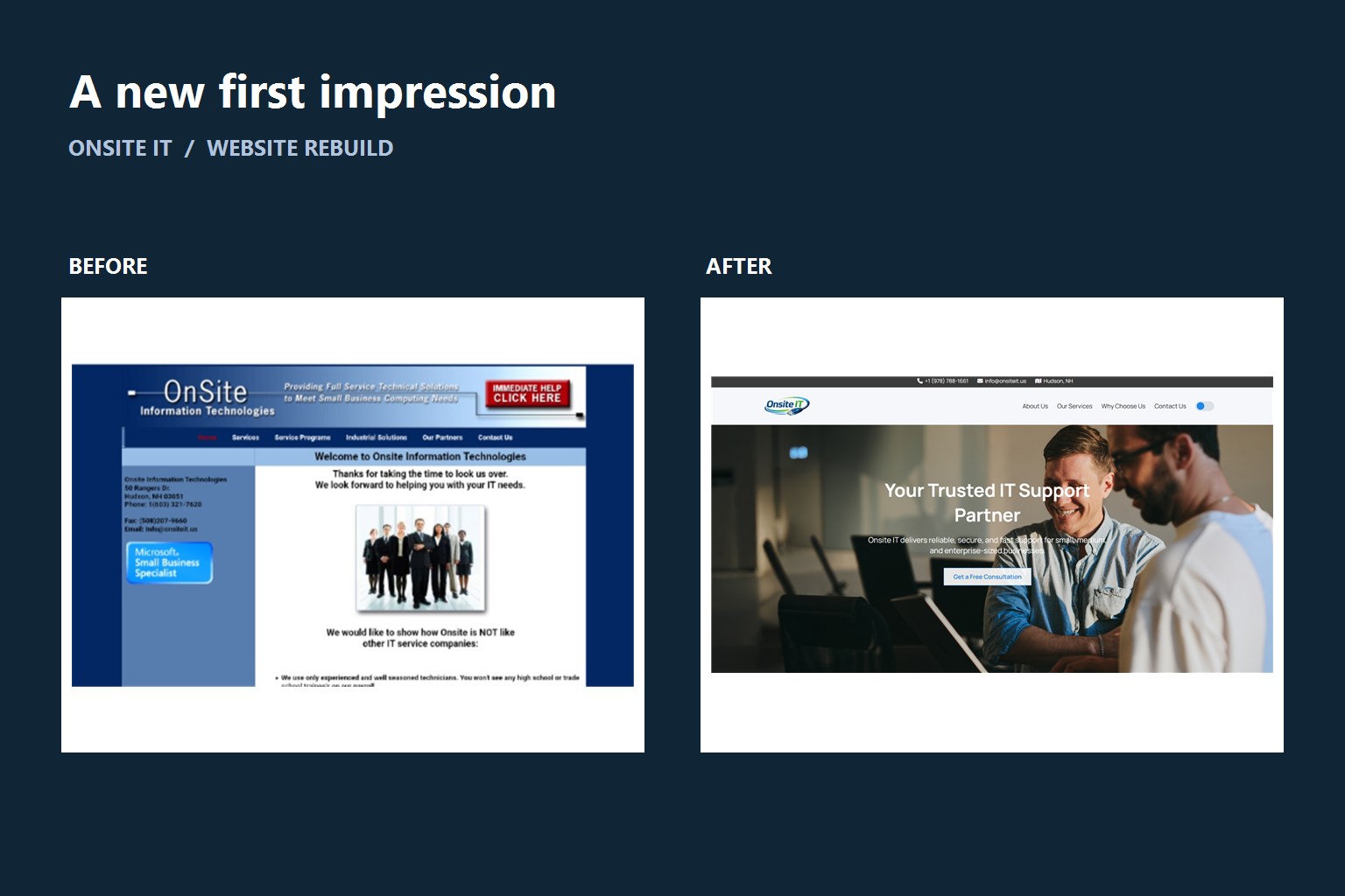
The screenshots below show the original homepage and the rebuilt version. Select either image for an enlarged view. Close it with the X, press Escape, or click outside the image. The before view is an AI-restored version of the original screenshot for readability; small visual details may differ. The after view is a website screenshot.


The original site already included useful information: a company introduction, service links, contact details, and a staff photo. The rebuild gives that information a clearer hierarchy, with a more prominent service message and next step.
Help visitors understand the business sooner
The old homepage placed its content in a compact panel surrounded by a dark background. Small text, several blue panels, and a dense sidebar competed for attention. A visitor could find information, but the page asked them to scan several areas to work out what mattered most.
The rebuilt homepage leads with “Your Trusted IT Support Partner,” a short explanation of the offer, and a visible consultation button. Navigation and contact information have distinct places at the top. Larger imagery and more breathing room make the page easier to scan.
We also simplified the navigation by reducing the number of separate pages and bringing related information together. Instead of making visitors open several pages to piece together what the company offers, the rebuilt site groups that information in clearer places. Fewer menu choices and more useful pages make it easier to find the right service and decide what to do next.
For another small business, the equivalent might be a contractor explaining which jobs they take, a clinic making appointment information easy to find, or a consultant describing who they help. The first screen should answer a practical question: am I in the right place?
Make the presentation support the expertise
A dated website does not mean a business delivers dated work. But visitors who have never met the team have limited evidence to judge. Consistent typography, readable content, relevant imagery, and obvious contact options can help the presentation reflect the professionalism behind the business.
Stanford's Guidelines for Web Credibility, published in 2002, identify professional presentation, useful content, and easy contact as contributors to perceived credibility. This is historical research, not a measurement of Onsite IT's results, but it provides a useful basis for these design choices.
For an IT company, the website is also an early interaction with its technical work. The rebuilt design gives prospective customers a clearer introduction before they call or submit a request. The aim is to reduce uncertainty and make a conversation feel like a natural next step.
Give interested visitors a clear next step
The original site provided contact information in its sidebar. The new homepage makes phone and email details prominent in the top strip and adds a “Get a Free Consultation” button beside the opening message. Integrated contact forms provide another way to start a conversation.
That matters because a visitor should not have to search for how to act once they are interested. A visible next step can reduce the effort between reading about a service and asking whether it fits their needs.
A responsive rebuild also needs to account for smaller screens and different ways of navigating. W3C's accessibility, usability, and inclusion guidance explains why these concerns should be addressed together. Readable text, clear controls, and usable forms deserve attention throughout a rebuild; a modern appearance alone does not establish accessibility compliance.
Less waiting, with an improved server
The rebuild also included an improved server, making the website much faster than the previous version. A server is the computer that delivers a website to your browser. Improving that foundation helps pages reach visitors sooner, rather than leaving them waiting for the site to catch up.
For a customer, the benefit is straightforward: less waiting while opening the site or moving between pages. Combined with the simpler navigation, the faster website makes finding service information and reaching out feel more direct.
This is a project improvement reported by the developer, rather than a published speed benchmark. Exact loading times still depend on the visitor's connection, device, and the page being viewed.
Build a useful foundation beyond the first impression
A strong homepage introduces the business, while service pages help customers explore the details. Clear headings, descriptive links, and useful explanations give visitors a path through the site instead of leaving everything in one crowded introduction.
Google's SEO Starter Guide recommends organizing content clearly and helping search engines understand pages. These are useful foundations for a rebuild, rather than a guarantee of search rankings.
The comparison here documents design and content changes. We are not claiming a measured increase in inquiries, sales, or search traffic. To evaluate those outcomes, a business should track qualified inquiries and completed contact requests before and after launch, alongside feedback from customers.
What this means for your small business
You do not need to wait until your website is broken to improve it. If the design no longer reflects your business, services are difficult to understand, or customers struggle to find the next step, a focused rebuild may be worthwhile.
Start by identifying what visitors need to know and do. Preserve useful content, plan the service pages and contact journey, and review the experience on phones as well as desktops. Keep existing URLs working or redirect them where necessary so an update does not strand visitors following older links.
Omni Stack Systems helps businesses turn those priorities into a custom website, from layout and service content through contact forms and ongoing care. The Onsite IT project is an example of bringing an established company's online presentation closer to the business it is today. Explore our work or learn about our website and development services to see what a rebuild could involve.
Your next step
Ready for a website that reflects your business today?
Tell Omni Stack Systems what feels outdated and what your customers need. We can help plan a focused rebuild with clear content and a straightforward path to contact.
Discuss your website rebuild
Founder & Solutions Architect at Omni Stack Systems. 18+ years in web development, with a focus on practical tools for small businesses. Meet the author.